Luno Money
Cryptocurrency For Everyone
Luno is the simple crypto investment app for everyone. They make it safe and easy to explore, buy and store crypto - no experience needed. Their mission is to put the power of cryptocurrency in everyone's hands.
In 2013, they set out to empower billions of people across the world by upgrading them to a more open, efficient, and inclusive financial system. To do that, they built a platform that makes cryptocurrencies such as Bitcoin and Ethereum easily accessible to everyone – whoever and wherever you are.
WEBSITE: Luno.com
SERVICES: Branding, Content creation, UX/UI, Web design, Product design and Animation.
Website Redesign
Background:
Luno, a prominent cryptocurrency exchange, has been a key player in the digital asset space. As the cryptocurrency landscape evolves and user expectations continue to shift, the need for a website redesign has become evident. The current website, while functional, may not fully capture the evolving demands of users, advancements in technology, and the competitive landscape of the crypto industry.
Problem:
Several challenges and opportunities have been identified in the current Luno website. These include:
• Outdated UI: The existing design may not align with modern UI/UX standards, potentially hindering user engagement and retention.
• Limited Educational Resources: As the crypto market expands, there is a growing need for comprehensive educational materials to cater to both beginners and experienced users.
• Competitive Pressures: With the emergence of new crypto exchanges and evolving user expectations, Luno faces the challenge of staying ahead in terms of features, security, and overall user experience.
• Mobile Optimisation: The increasing use of mobile devices for cryptocurrency trading necessitates a responsive and feature-rich mobile experience.
High-Level Goal:
The overarching goal of the website redesign is to elevate the overall user experience and position Luno as a leading, user-centric cryptocurrency exchange. This involves addressing the identified problems and seizing opportunities to:
• Enhance User Interface: Implement a on brand, modern and intuitive design that not only meets industry standards but also sets new benchmarks for user experience in the crypto space.
• Expand Educational Resources: Develop and integrate comprehensive educational resources, catering to users at different levels of expertise and fostering a community of informed traders.
• Stay Competitive: Introduce innovative features, strengthen security measures, and ensure that Luno remains at the forefront of the cryptocurrency exchange industry.
• Optimise for Mobile: Prioritise mobile optimisation, ensuring that users have a seamless and feature-rich experience regardless of the device they use.
The redesign aims to not only address existing challenges but also anticipate future trends, positioning Luno as a reliable, forward-thinking platform for cryptocurrency enthusiasts and investors.
Competitor Research
Personas
IA/Mapping
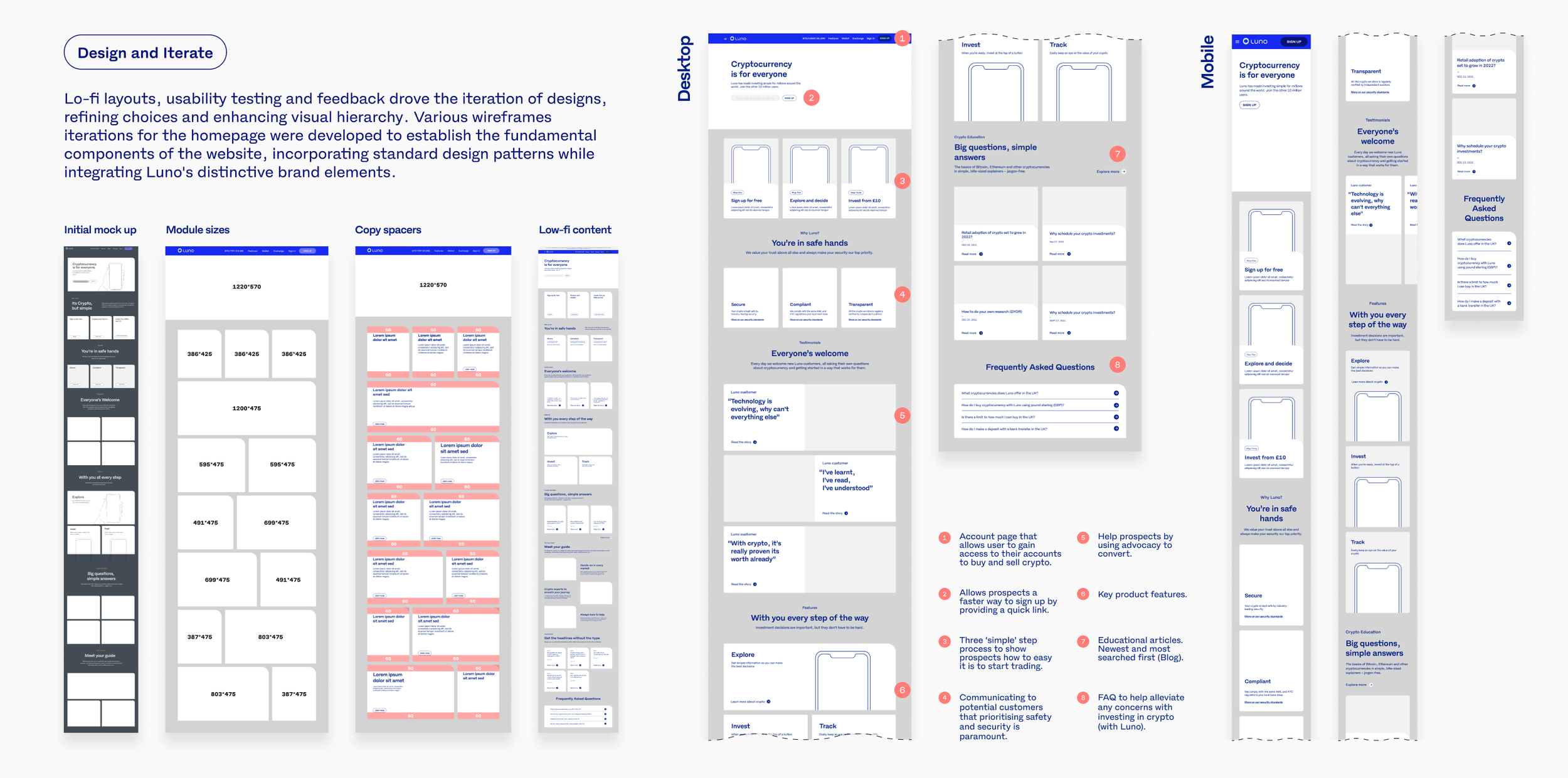
Low-Fi Layouts
UI Toolkit
Hi-Fi Designs
Figma prototypes
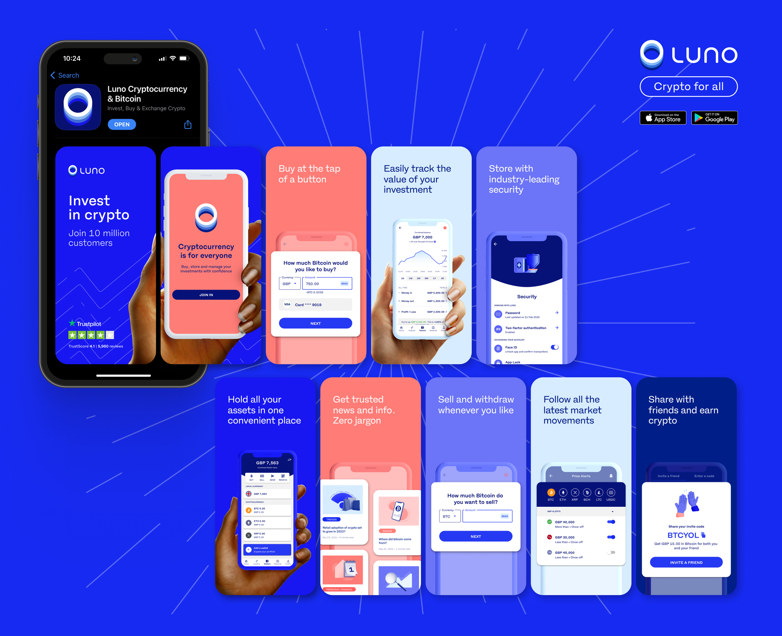
App Store Refresh
As part of the brand update, I was tasked into refreshing the App store screens shots to reflect our latest tech and feature updates but also our new identity. Adapting screenshots to align with evolving design trends and platform guidelines ensures that the app stays visually appealing and aligns with user expectations, ultimately contributing to increased visibility, downloads, and overall user satisfaction.
App Store narrative
Hands Photoshoot
During the app store design process, we identified the need for a collection of images featuring diverse hands holding both iOS and Android devices, suitable for utilisation across our marketing materials. I undertook the responsibility of art directing the shots and actively sourcing the model and poses to meet this specific requirement.
Studio set-up during shoot and original images
Marketing Preference Centre
In our commitment to openness and clarity, I undertook the task of crafting a marketing preference page. This sits at the end of the product onboarding journey and the page empowers users to specify their desired communication preferences, ensuring a personalised and transparent experience.
Product Marketing Screens
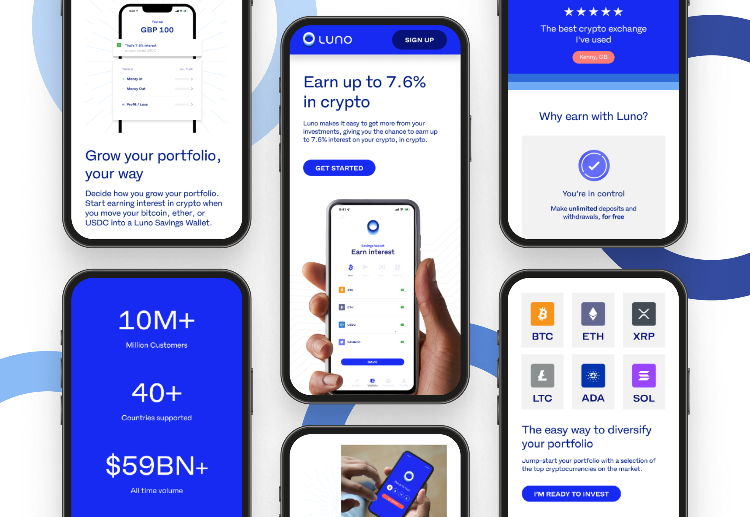
Based on research insights and user feedback, we discovered that utilising app screens directly from the product in marketing materials was perceived as overly complex by our audience. This complexity generated unease about downloading the app and initiating their first cryptocurrency transaction. Subsequently, I received the assignment to streamline and redesign several app screens, providing the team with user-friendly alternatives for content creation.
The images on the bottom row are the simplified version of the original app screens above.
Third-Party Landing Pages
Wanting to understand and service our customers better, we undertook the task to use a third-party CMS platform to create bespoke campaign pages. These pages were strategically linked to our creative content to attract prospective customers. Following integration into our platform, we gained access to valuable data, including heat maps, impressions, and performance metrics.
Preliminary Insights
Utilising heat maps on ‘Instapages’ allowed the team to better understand how users interact with the landing pages.
Campaign: Buy and Wallet
Initial results: Exploring the heat-maps above reveals they indicate significant interest to ‘create wallet’ through the clicks on the CTA's. Interestingly, prospect customers perceived the imagery as interactive, signifying a keen interest in exploring further about the price of crypto and how to receive it.
Actions taken: Transformed the static creative visuals into an animation, illustrating the dynamic fluctuations of BTC value based on the chosen fiat currency amount.
Campaign: Invest
Initial results: From looking at the heat-map (Invest) we can see that prospect customers are highly engaged with the FAQ section. They are interested in potential growth of investing in crypto.
Actions taken: Added a 'Learn more' CTA within the expandable FAQ, directing users to a dedicated web page providing an overview of cryptocurrencies.
CRM Refresh and BAU
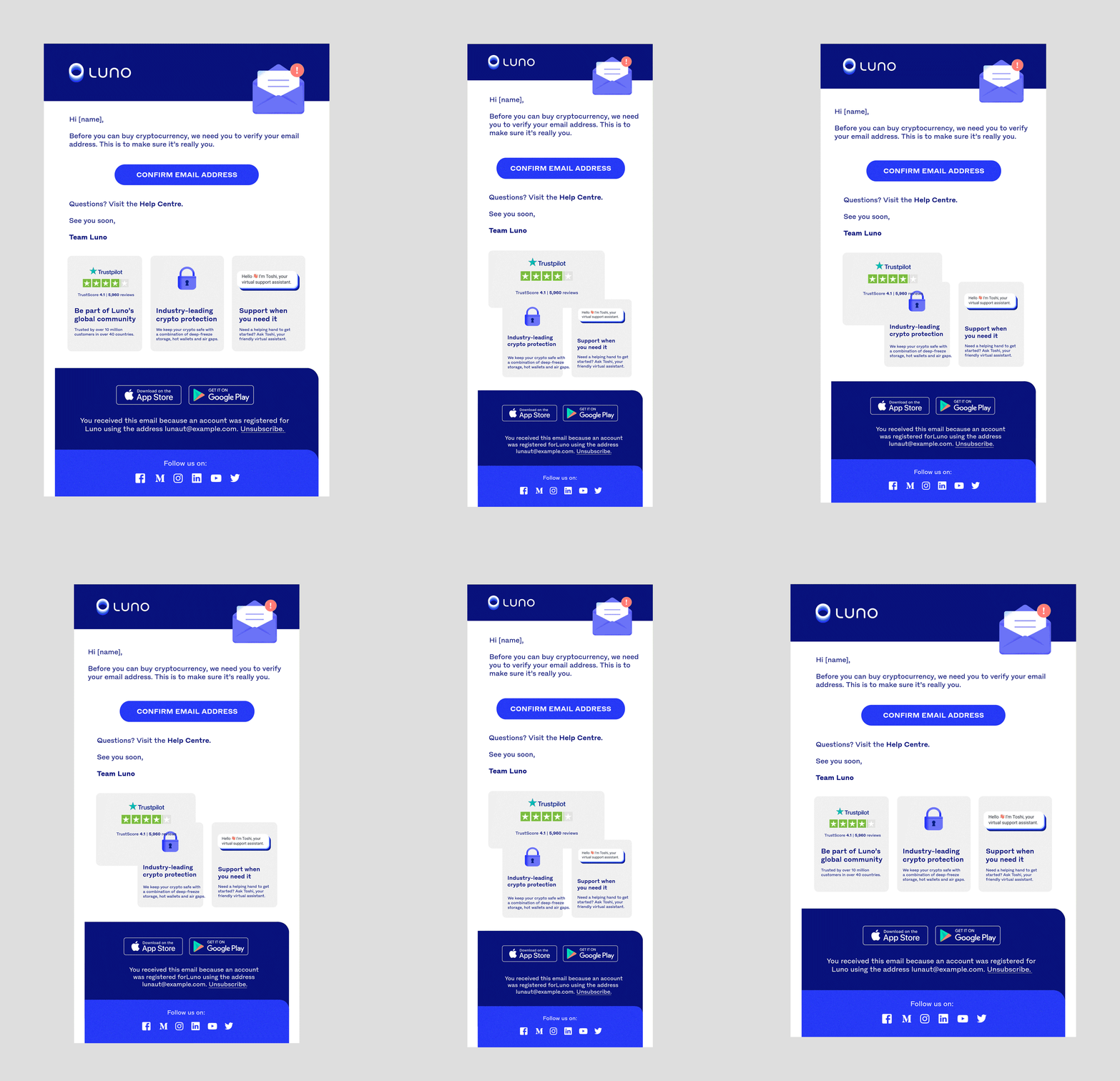
Following the brand refresh, a comprehensive assessment of Luno's daily customer interactions was imperative. Recognizing CRM as a pivotal catalyst for converting both new and existing customers, a reconsideration of our templates was initiated. The outcome was positive, reflected in a significant increase in email opens and renewed engagement with the app. (+9% up lift in New users and +39% up lift Total sessions).
OLD template (15/1/23) vs NEW template (22/1/23)
+20% (average) unique opens across 6 markets.
+5% who logged into the App after opening newsletter.
+13% Increase in length of session.
+26% increase in placing deposits after logging into App.
Marketing Emails
Onboarding Emails
Responsive Email Layout
Newsletter Emails
Onboarding Video
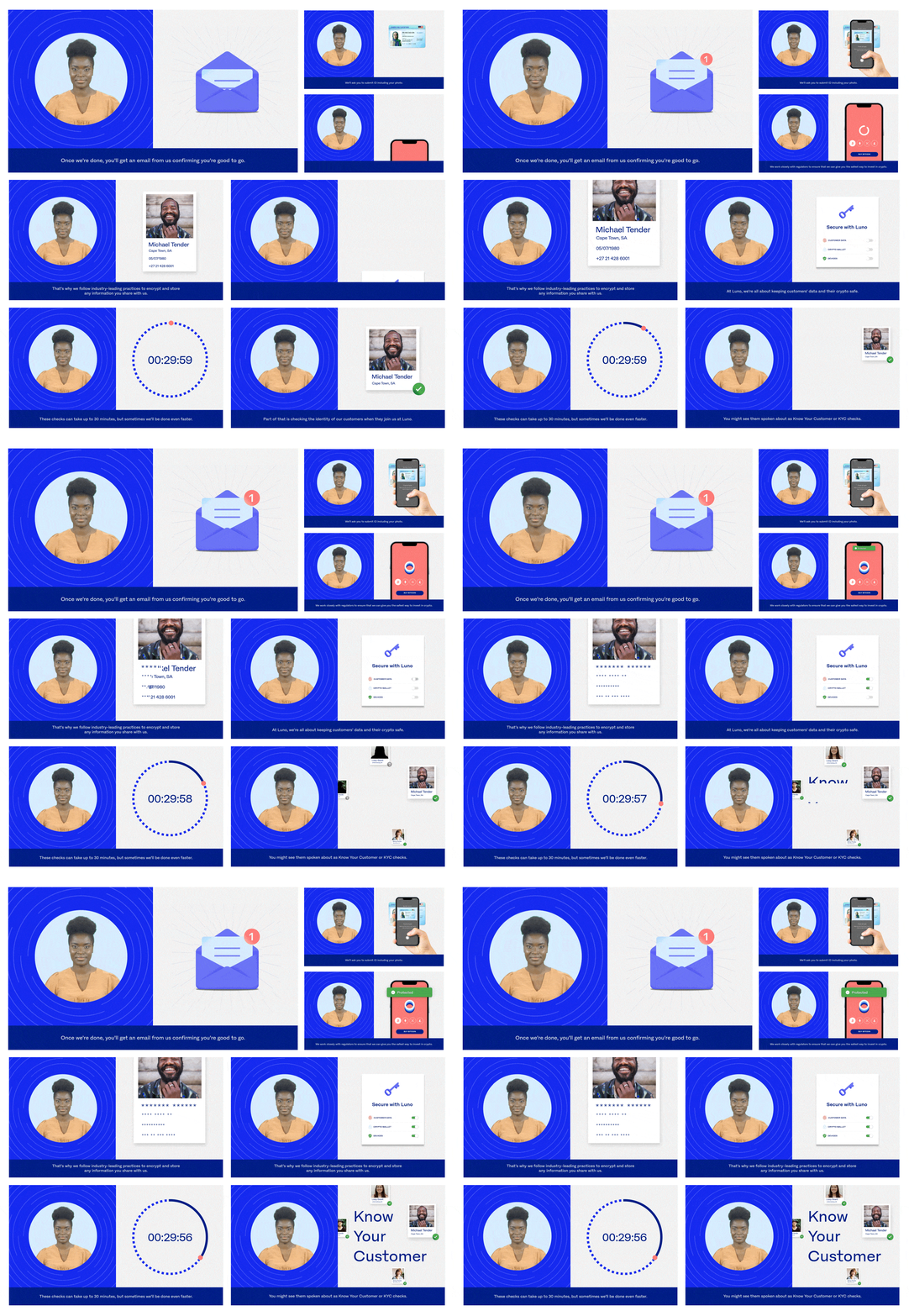
In certain countries, the onboarding procedure can be a lengthy and intricate one due to the highly regulated nature of the Crypto industry. Recognising a considerable drop-off rate during the onboarding phase for customers attempting to make their first crypto purchase with Luno, we proactively addressed this issue by creating an onboarding animation. This video guides users through each step of the process, outlining the necessary customer details, the duration of each step and the reasons behind Luno's procedural requirements.


